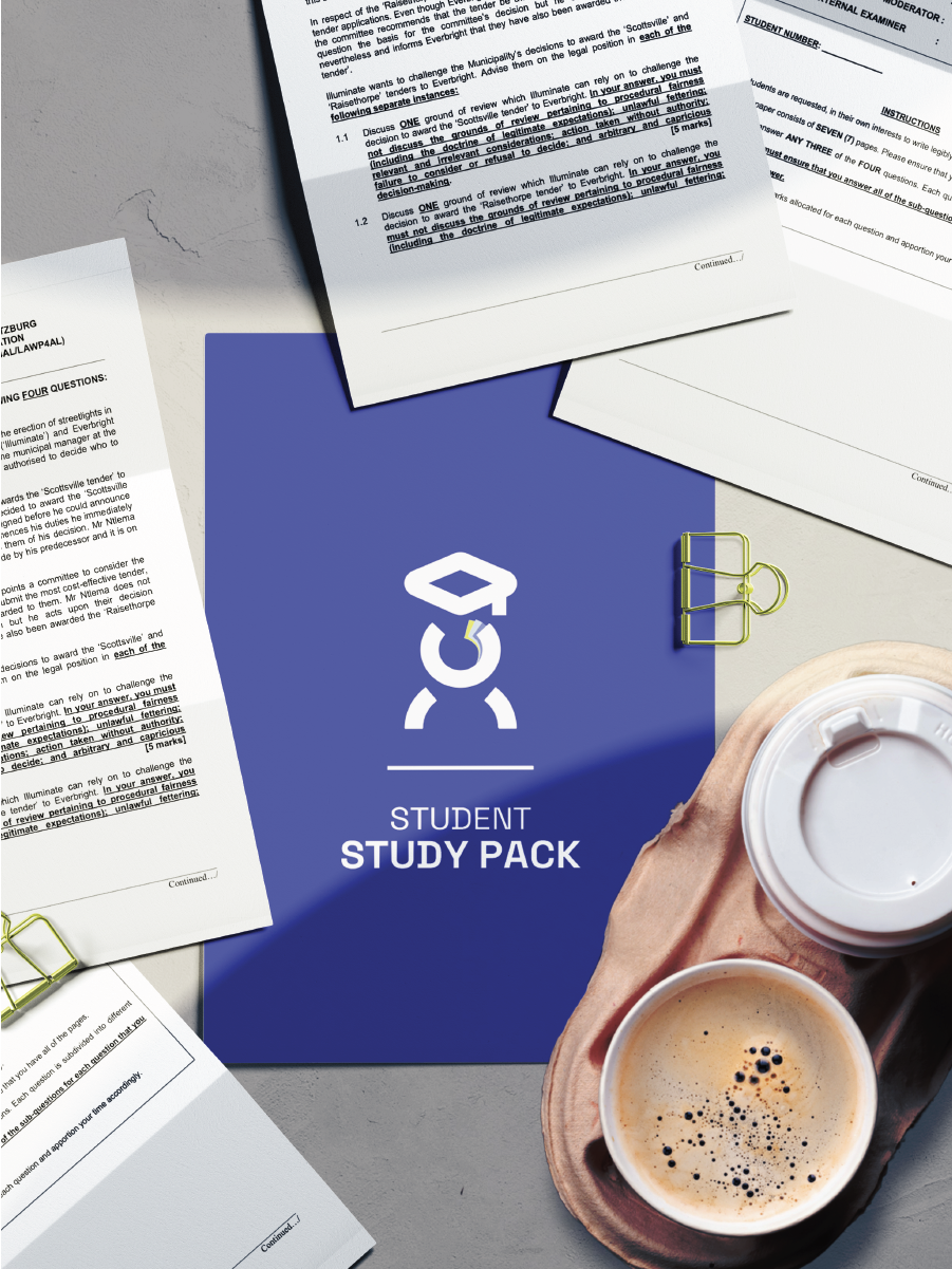
Pass & Prosper

Education Tech
Brand Identity & Strategy
Pretoria, South Africa
2024
GreyEd’s core purpose is to revolutionize and democratise education through hyper- personalized learning experiences, leveraging AI to adapt to each student’s unique cognitive and emotional needs. GreyEd provides individualized academic support that blends emotional intelligence with academic growth, making education more accessible, inclusive, and tailored for each student. This approach is not just about academic success, but also about fostering self-awareness, emotional growth, and a deeper understanding of one’s learning journey.
Summary
Pass & Prosper is a forward-thinking education platform that reimagines tutoring and study support for the modern student. With a mission to simplify learning and remove intimidation from academic success, the platform offers clear, relatable, and curriculum-aligned support—designed especially for high school learners preparing for exams. As the brand evolved from an idea into a growing community, it needed a visual identity that would feel youthful, intelligent, and confident—without being overly formal or institutional. We were brought in to create a cohesive brand identity that could champion both clarity and connection, and empower students to feel capable, confident, and seen.
Challenge
Pass & Prosper had strong potential and a meaningful goal: helping students succeed on their own terms. But it lacked a clear visual language to express its personality and purpose. Without a unified brand identity, the platform risked feeling generic or unmemorable in an already-saturated academic space. There was also a fine balance to strike: the brand needed to speak to both Gen Z students and their guardians or educators—professional, but never cold; academic, but never overwhelming.
Solutions
We developed a bold, contemporary identity rooted in the concept of academic elevation and guided progression. The name itself—Pass & Prosper—became the north star for the entire system. Our visual direction was built on the metaphor of movement: passing through challenges and rising into new levels of understanding. The typography system pairs bold confidence with digital clarity, while the color palette features high-contrast yellow and black for urgency, visibility, and approachability. We also developed a modular icon system and subtle patterning that supports use across social content, digital tools, and print material.
To further differentiate the brand, we infused every design element with youthful energy and structure—a balance between vibrancy and focus that mirrors the mindset of today’s ambitious student. The result is an identity that positions Pass & Prosper not just as a tutoring brand, but as a study partner and growth catalyst in the academic journey.